Bell is one of Canada’s largest telecommunications providers, serving millions of customers across mobile, internet, TV, and home phone services. Despite its scale, Bell’s digital self-serve experience had fallen behind modern user expectations, especially within billing, one of the most critical and frequently used touchpoints.
As part of Bell’s digital transformation initiative during the pandemic, the goal was clear:
to modernize the billing experience, reduce support dependency, and rebuild customer trust through intuitive design, accessibility, and transparency.
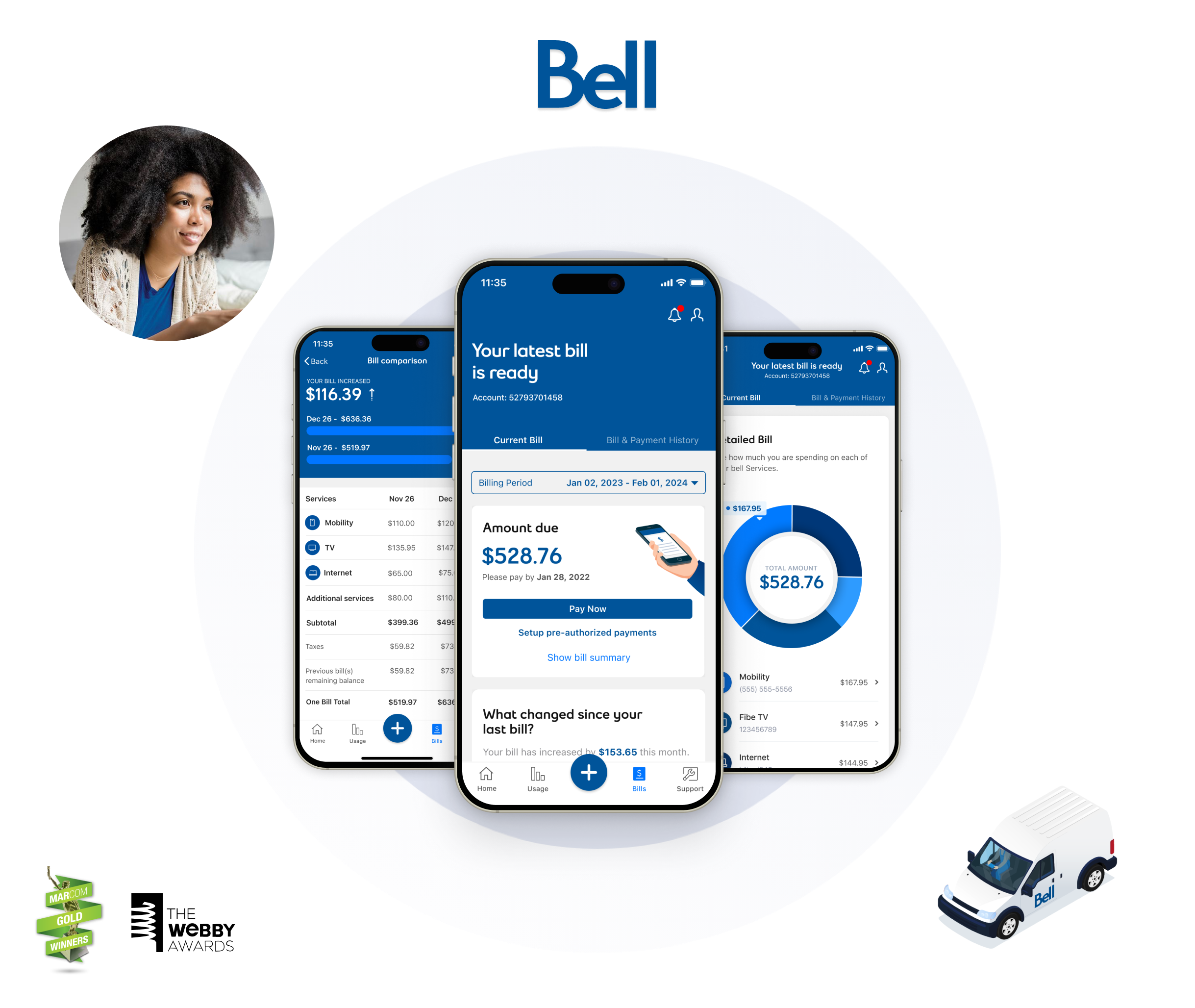
As Senior Product Designer, I partnered with Product, Analytics, and Engineering teams to rethink the mobile billing journey end-to-end, turning static PDF invoices into an interactive, data-driven experiencethat empowered users to self-serve confidently.
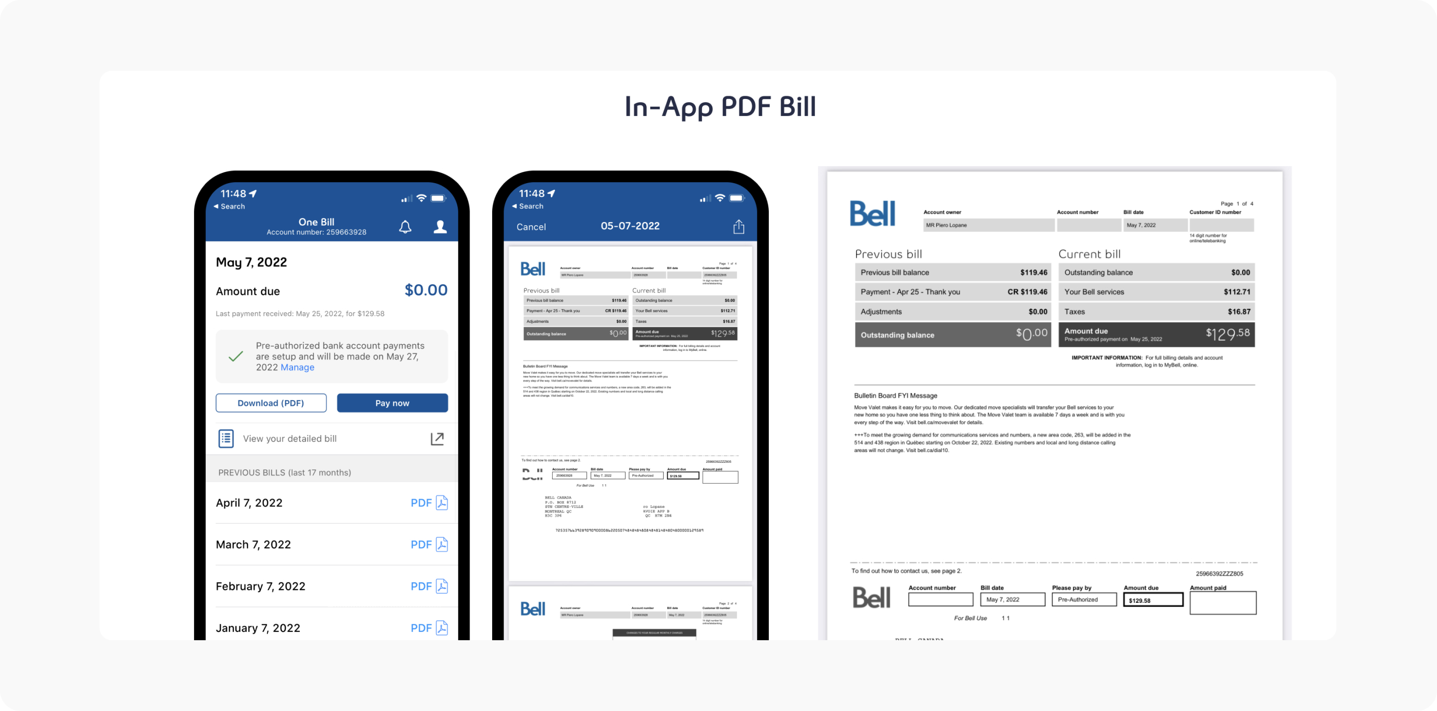
Bell's mobile app provided billing information through static PDF invoices—documents designed for print, not digital interaction. These PDFs lacked detailed breakdowns, interactive features, and mobile optimization, creating frustration for users who struggled to understand their charges, compare bills over time, or access billing details on their devices. The poor mobile billing experience drove thousands of customers to call support each month, creating significant operational costs and eroding user trust in self-service channels.
User Frustrations:
Users only had PDF invoices in the app. PDF invoices lacked detailed information and were an overall bad mobile experience because they were hard to access, use, and track. They were also not interactive, integrated, or accessible to users with disabilities.
The Business:
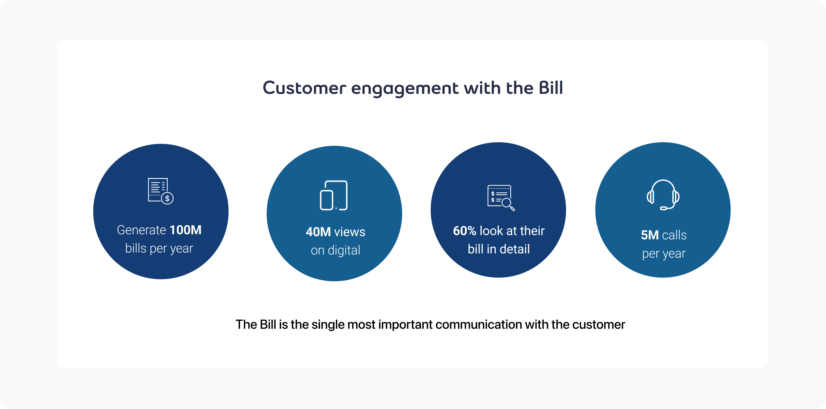
The lack of visibility and data points on this format of bill, created a large volume of inbound customer service calls regarding billing.
I owned the end-to-end experience design for Bell's unified billing system—transforming static PDF invoices into an interactive, accessible, and mobile-optimized billing experience. Working alongside product managers, engineering teams, and accessibility specialists, I led the design workstream from discovery through delivery, creating a unified bill that reduced support calls, improved user understanding, and restored trust in self-service billing channels.
Bell's leadership recognized that PDF-only billing created significant operational overhead and user frustration. The unified billing initiative aimed to transform billing from a support driver into a self-service success. Key business objectives included:
We benchmarked billing experiences from leading telecommunications providers (Rogers, Telus, Verizon, T-Mobile) and financial services platforms (banks, credit card companies) to inform a more intuitive, interactive billing experience. Key insights revealed that successful billing interfaces prioritize transparency, comparability, and interactivity—allowing users to drill into charges, compare periods, and understand changes over time. We adapted these patterns to Bell's service ecosystem, creating a unified bill that transformed billing from a source of confusion into a tool for understanding and control.
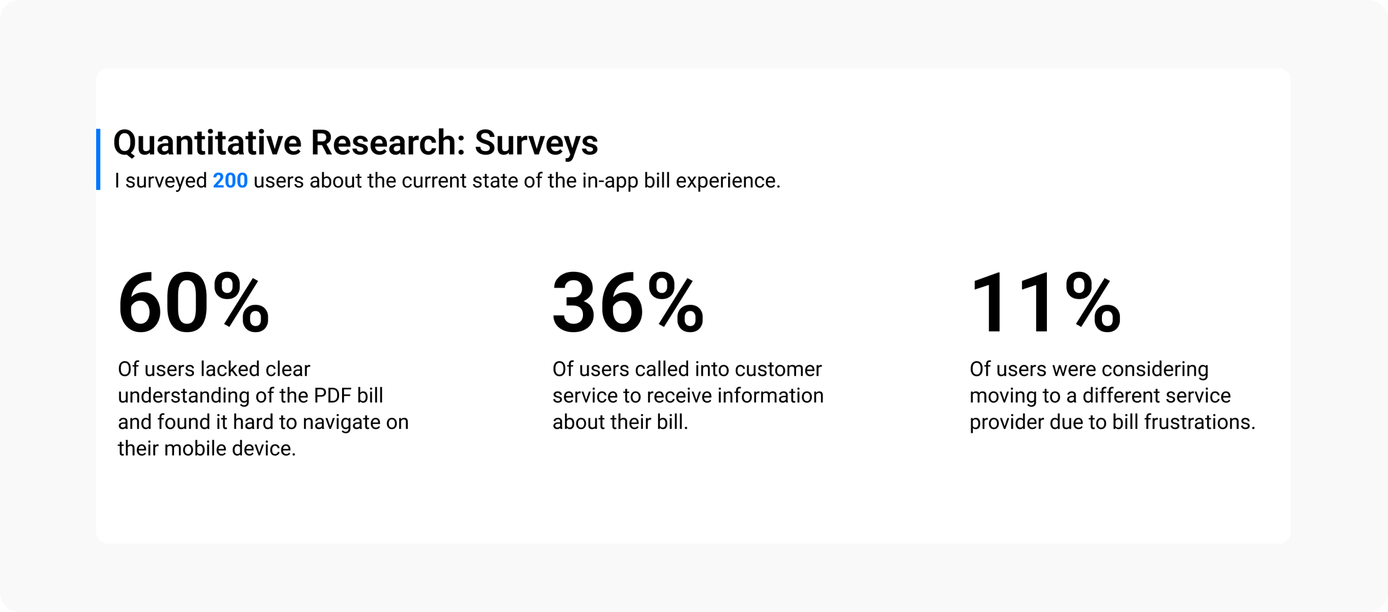
Interviews with 200 Bell customers and analysis of support ticket data revealed consistent patterns around billing frustration:
These insights shaped our approach: creating an interactive, accessible, and transparent unified billing experience that enables self-service understanding.
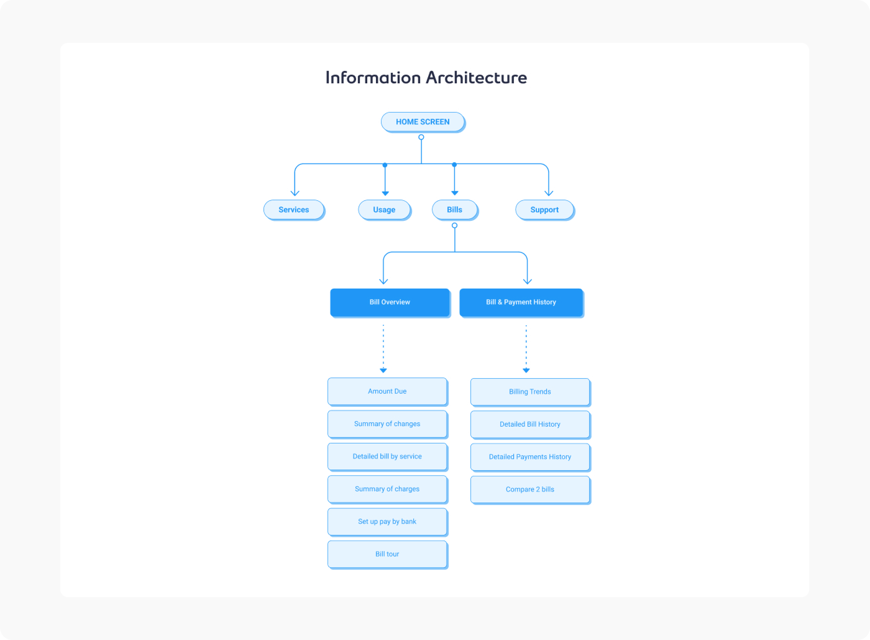
We designed a unified billing interface that transforms static PDF invoices into an interactive, accessible, and mobile-optimized experience. The unified bill provides detailed charge breakdowns, period-over-period comparisons, and interactive features that enable users to understand their charges without calling support—turning billing from a source of confusion into a tool for transparency and control.
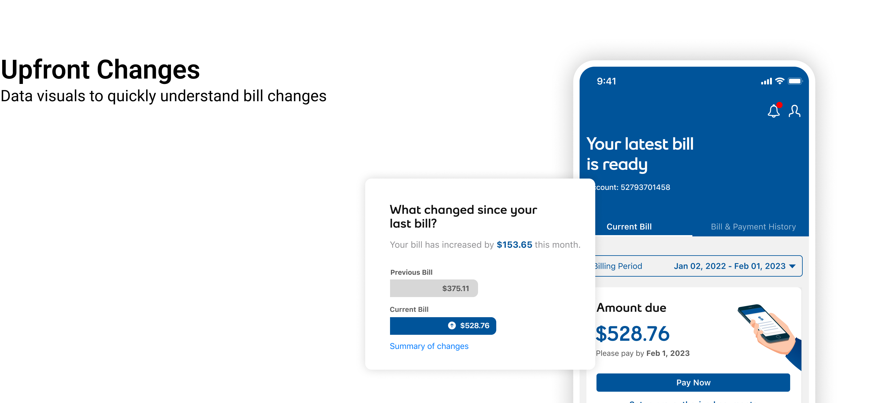
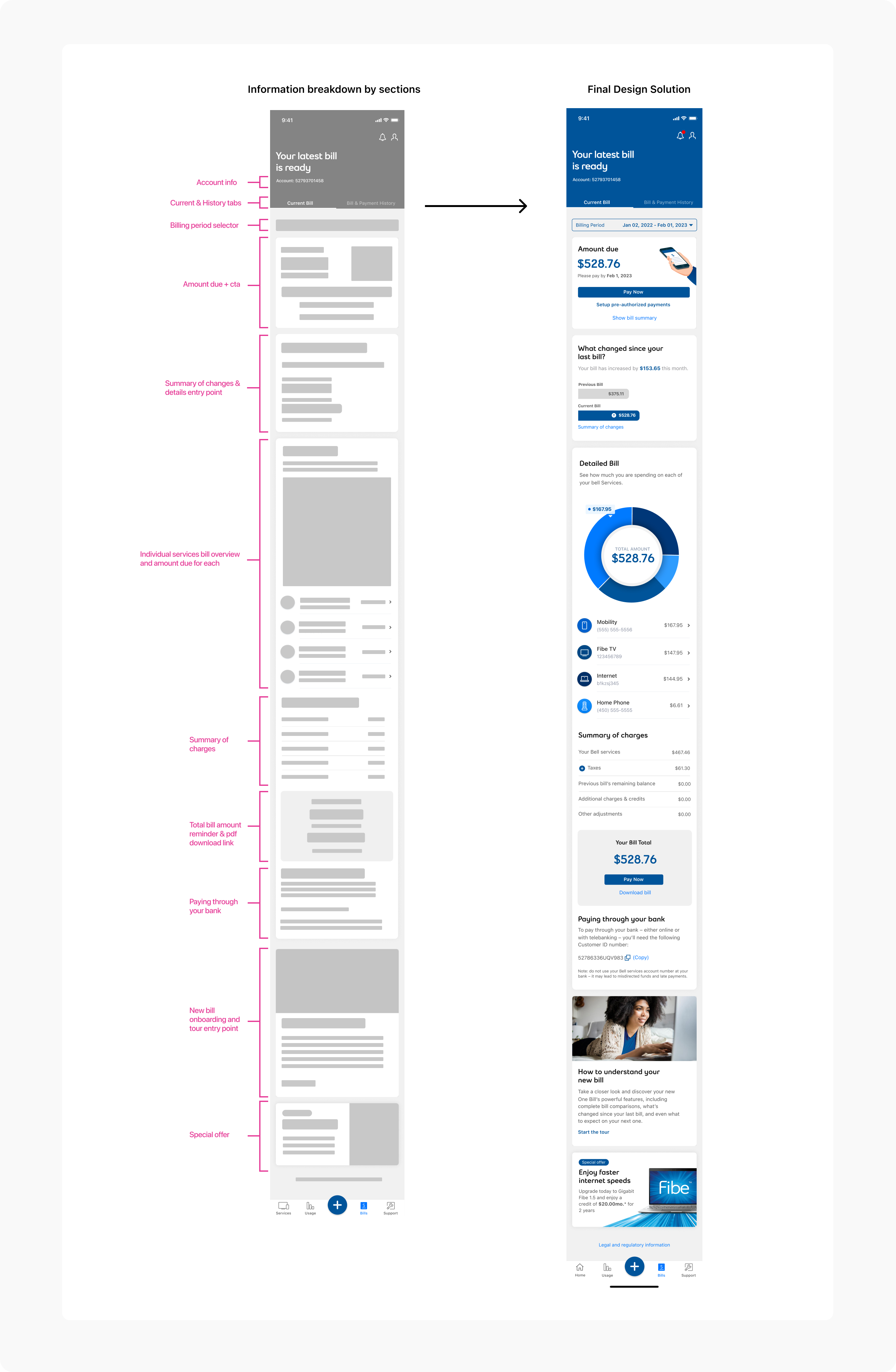
Replace static PDFs with expandable, drill-down charge details. Users can tap any charge to see explanations, dates, and context—making it easy to understand what each line item represents and why it appeared on their bill.
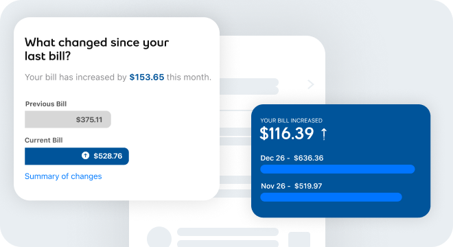
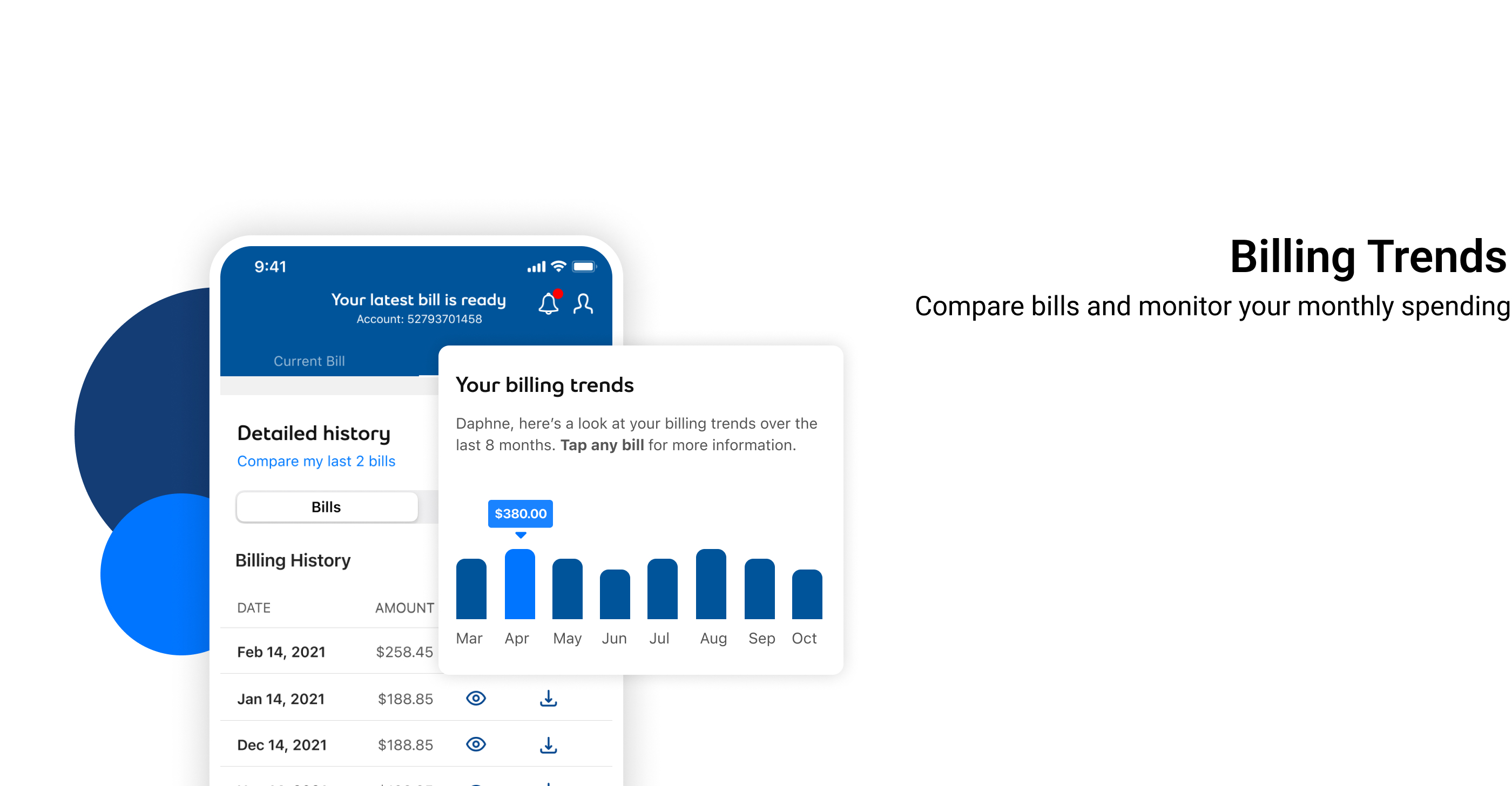
Enable users to compare current and previous bills side-by-side. Highlight changes in charges, services, and usage—helping users understand why their bill amount changed and identify trends over time.
Provide users with a real-time view of their total charges as they make plan, feature, or usage changes during the billing cycle. The dynamic summary updates automatically, showing how modifications impact the next invoice, increasing transparency and reducing billing confusion.
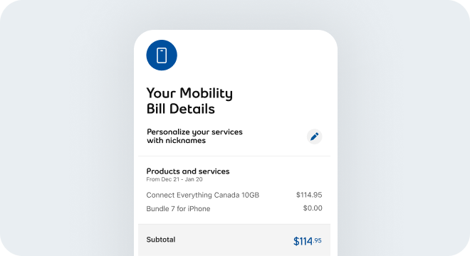
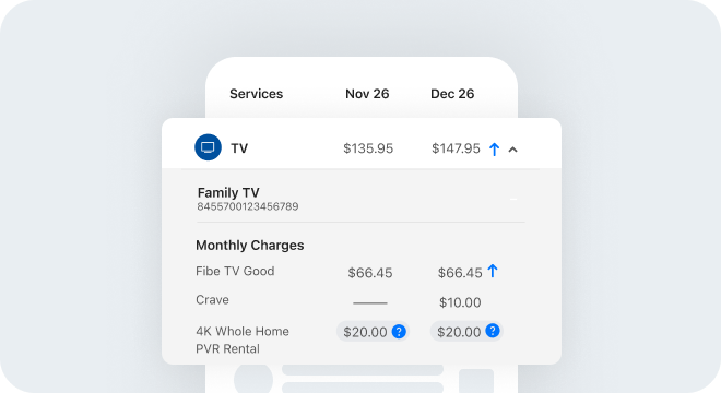
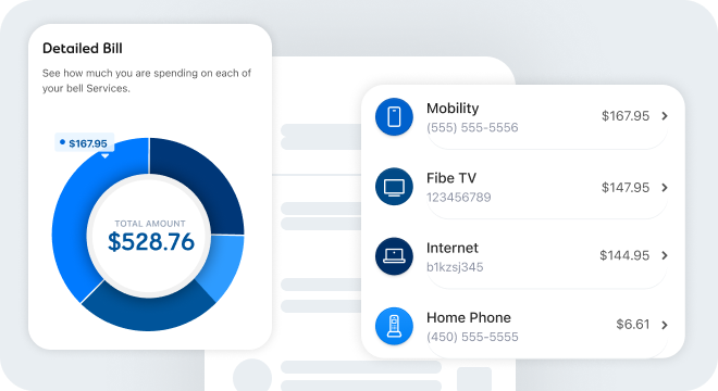
Offer a detailed view of charges per service; mobility, internet, TV, and home phone, including subtotals, discounts, and promotional adjustments. This granular breakdown helps users understand exactly what they’re paying for, compare across services, and identify changes over time.
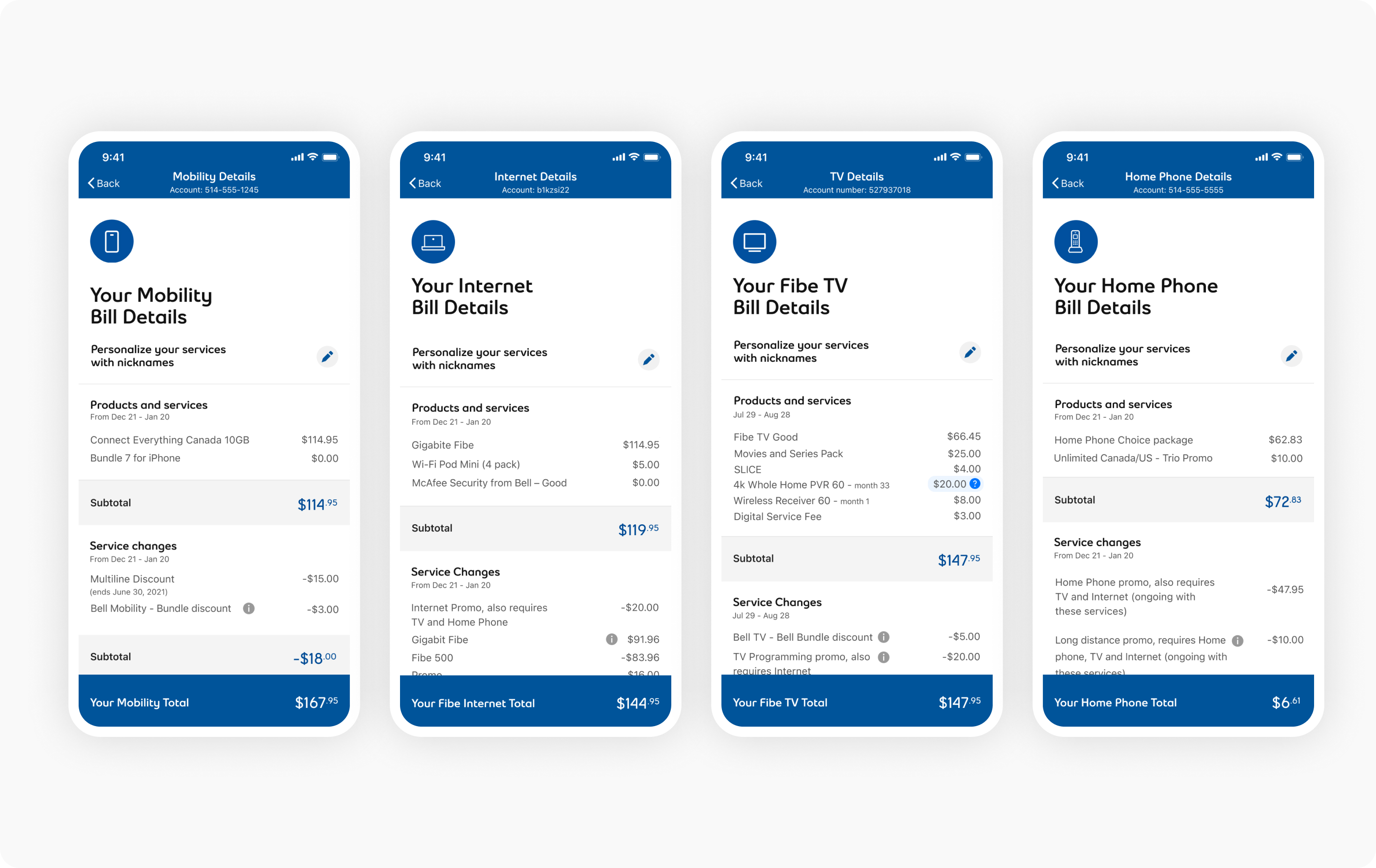 Design of the services details breakdowns for each service offering.
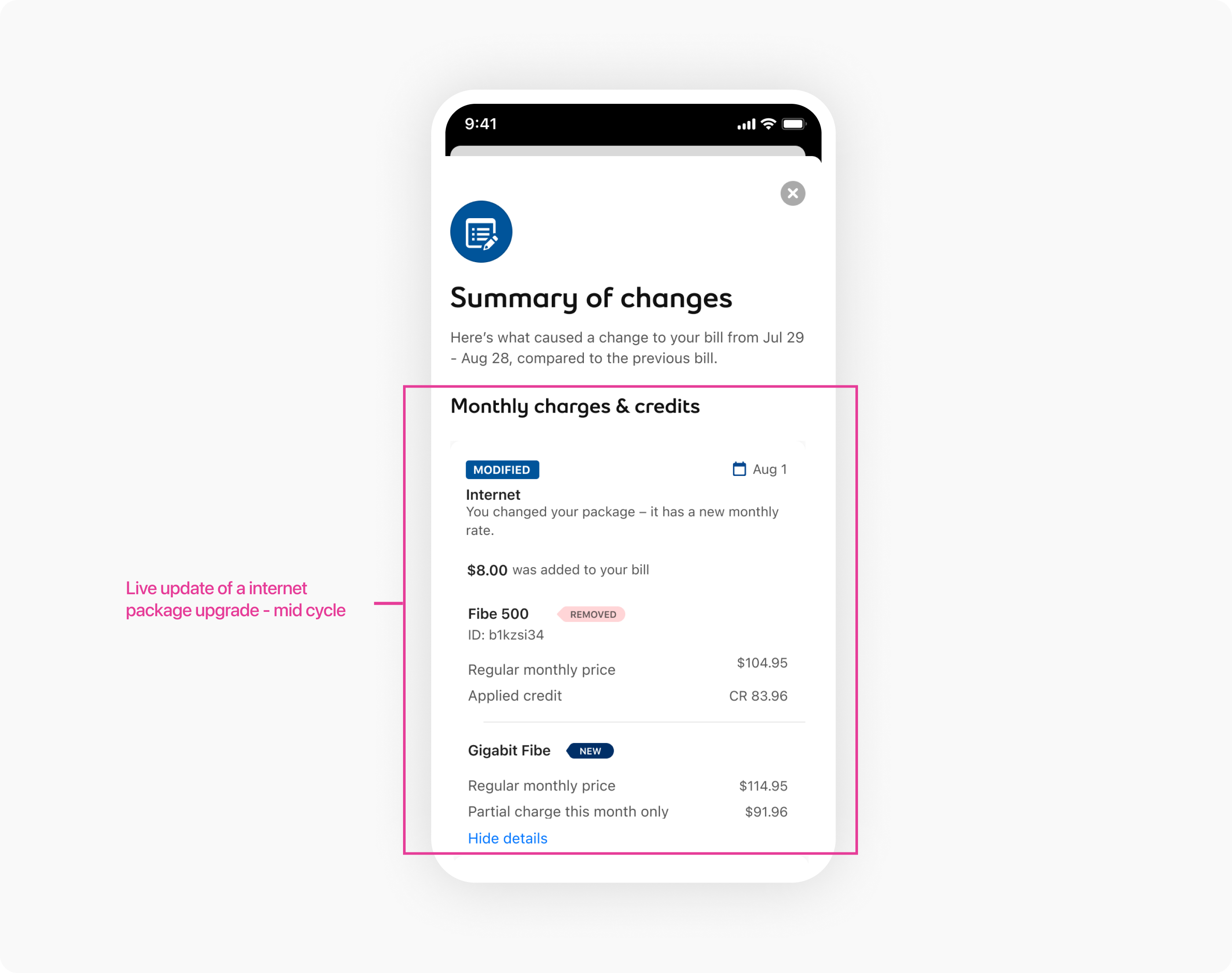 Design of the summary of changes, in real time.
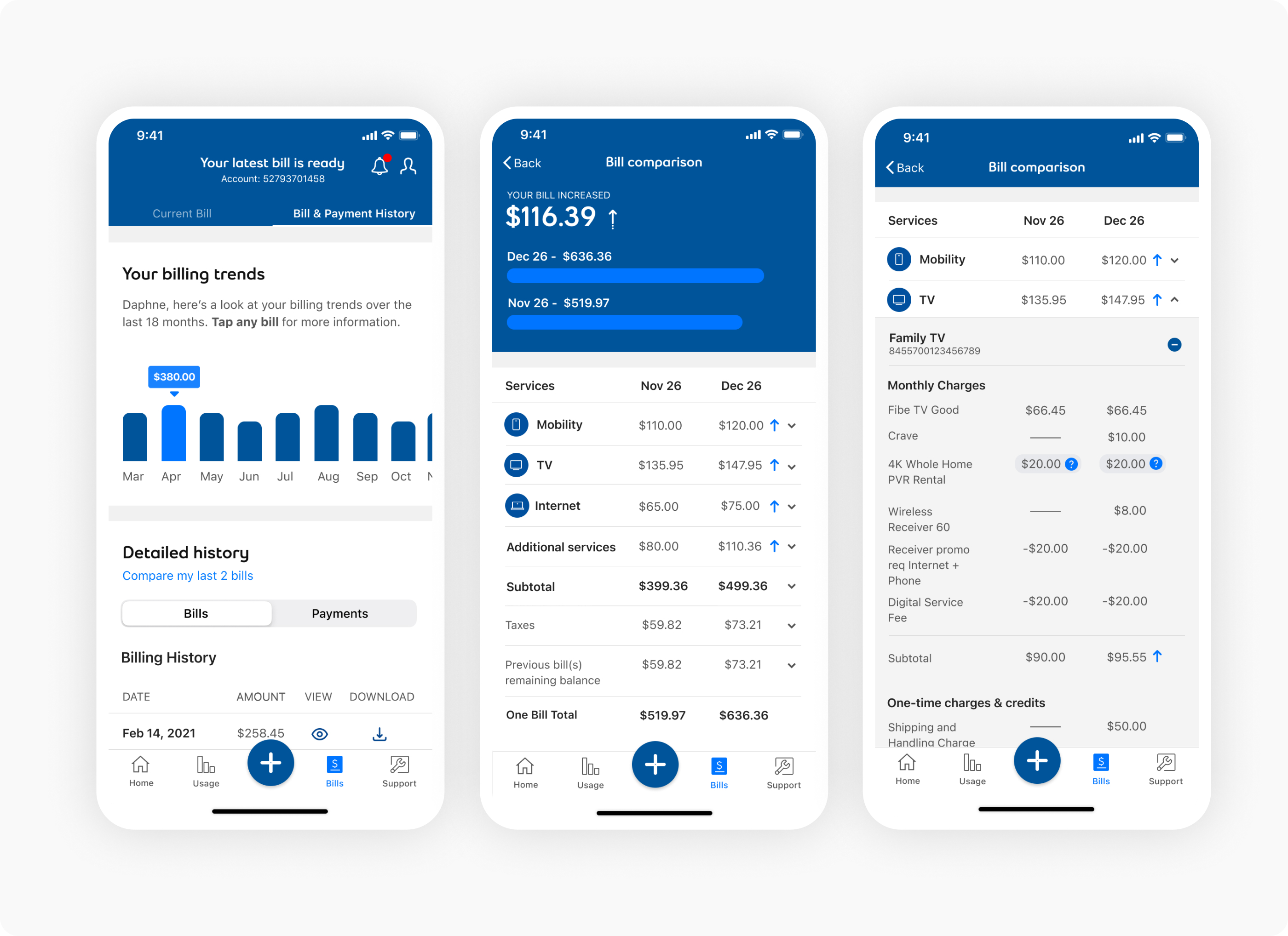 Design of the bill history and comparisons.
To extend the value of unified billing beyond static viewing, we designed a comprehensive bill management system that consolidates multiple services (mobile, internet, TV, home phone) into a single, interactive bill view. The unified architecture allows users to see all charges across services in one place, compare usage patterns, and understand their complete billing relationship with Bell.
The unified bill introduced intelligent charge categorization, usage insights, and predictive billing estimates—helping users anticipate future charges and identify opportunities to save. By combining transparency, interactivity, and accessibility, the unified billing experience transformed billing from a source of confusion into a tool for financial understanding and control.
The unified billing initiative transformed Bell's billing experience from a support driver into a self-service success—successfully bridging user confusion with business efficiency through transparency, interactivity, and accessibility.
Measured Outcomes:
The success of unified billing demonstrated that billing confusion could be solved — not through more support staff, but through smarter, more transparent billing design.
Through this initiative, we learned that effective billing design goes beyond displaying charges. It requires transparency, interactivity, and accessibility. By aligning product, design, and engineering around a shared goal of self-service understanding, we transformed static PDFs into interactive experiences, reduced user confusion, and decreased support volume. Clear charge explanations, period comparisons, and inclusive design standards proved essential in turning a source of confusion into a tool for transparency and control.
Most billing support calls stem from confusion, not actual billing errors. During research, we learned that users couldn't understand why bill amounts changed—not because charges were incorrect, but because PDF invoices lacked context and comparability. By designing interactive charge breakdowns and period comparisons, we enabled users to answer their own questions before calling support. The key was making billing information scannable, drillable, and comparable—transforming billing from a black box into a transparent statement.
PDF invoices weren't just hard to read on mobile—they were fundamentally incompatible with mobile interaction patterns. Zoom-and-pan created frustration, and static layouts couldn't leverage touch interactions or native scrolling. We designed billing specifically for mobile devices with expandable sections, touch-friendly interactions, and progressive disclosure. By replacing PDF constraints with native mobile patterns, we created a billing experience that felt native, fast, and intuitive—significantly improving mobile billing engagement and satisfaction.
Accessibility barriers prevented users with disabilities from understanding their bills, forcing them to call support for explanations. By designing billing with full accessibility support—screen reader compatibility, semantic markup, and keyboard navigation—we enabled all users to access billing information independently. This not only improved equity and inclusion but also reduced support volume by enabling self-service for users who previously had no alternative to calling support. Accessibility became a business driver, not just a compliance requirement.
Thanks to cross‑functional partners across product, research, engineering and operations.
Mentored 3 junior designers on accessibility testing and user research, perfecting their visual design craft and shaping them into confident contributors to future mobile-first UX projects.