Bell is one of Canada’s largest telecommunications providers, serving millions of customers across mobile, internet, TV, and home phone services. Despite its scale, Bell’s digital self-serve experience had fallen behind modern user expectations, especially within billing, one of the most critical and frequently used touchpoints.
I led the UX direction for optimizing billing and invoice-related experiences within the MyBell Mobile ecosystem. The initiative focused on reducing confusion around charges, increasing customer confidence in bill accuracy, and improving callable self-service pathways through simpler, more predictable interactions.
This initiative required balancing regulatory requirements, complex billing models, and diverse user expectations across high-volume customer segments.
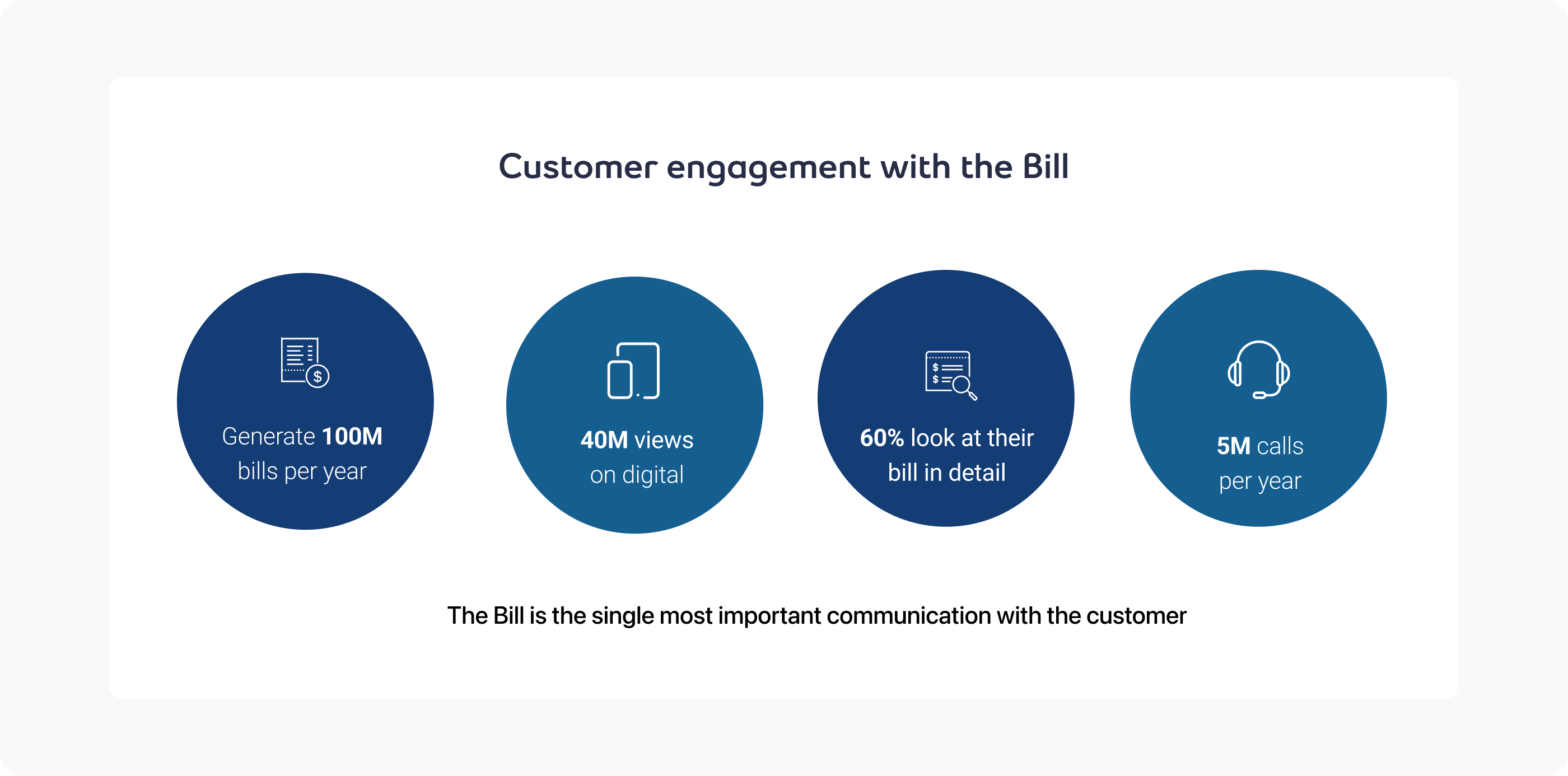
The billing experience in MyBell Mobile serves tens of thousands of customers per month and directly affects satisfaction, churn risk, and support costs. Billing misunderstandings are one of the leading drivers of support calls within the Bell ecosystem.
Users engage with billing information across multiple contexts (monthly summary, historical invoices, charge details), often without clear mental models of what each line item represents.
Customer frustrations:
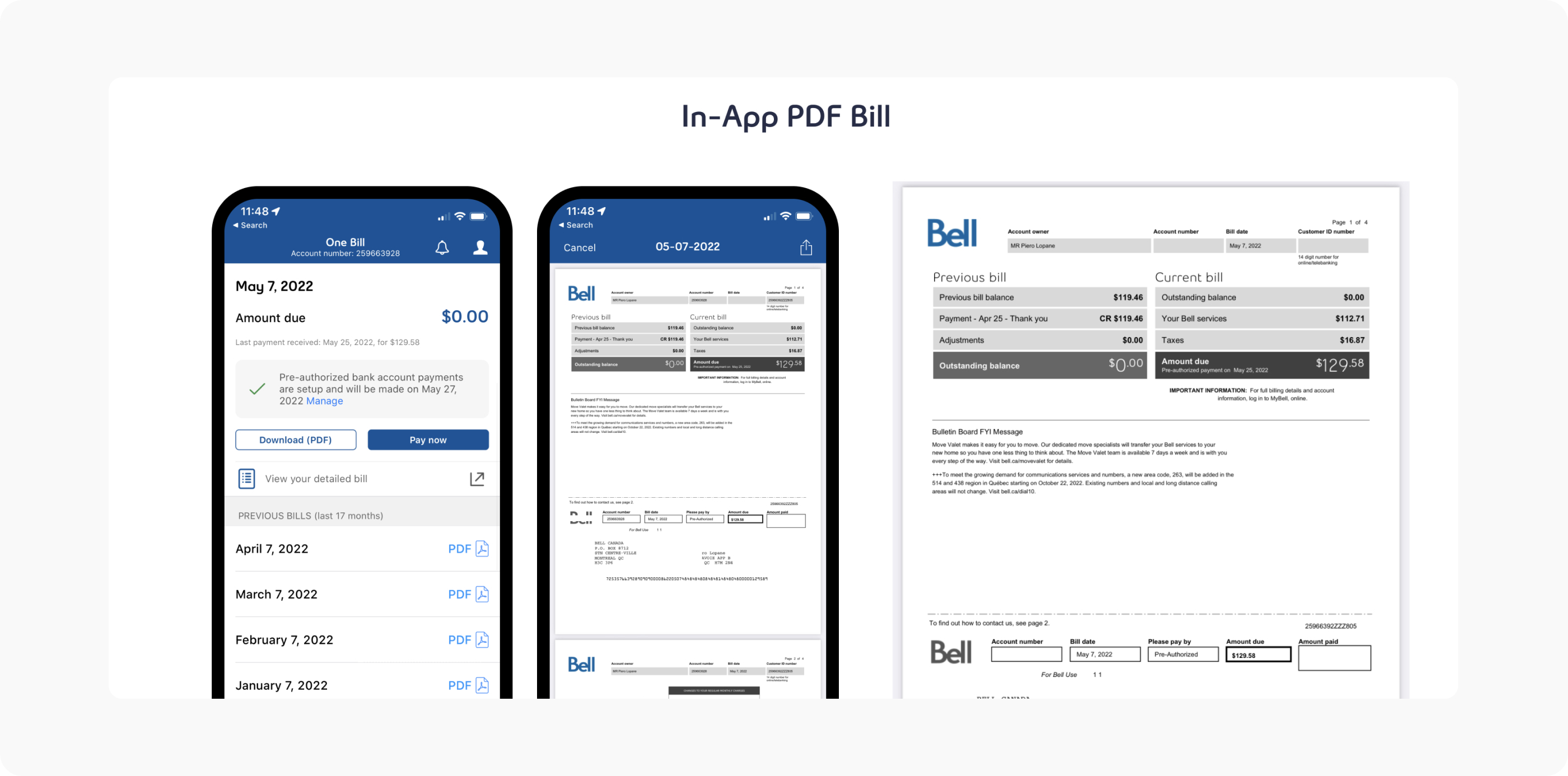
Customers only had a static PDF invoice in the app and frequently reported:
The business problems:
I owned the end-to-end experience and more specifically:
I also worked closely with Analytics to identify patterns in confusion signals and prioritized areas with the highest support cost impact.
Bell's leadership recognized that PDF-only billing created significant operational overhead and user frustration. The unified billing initiative aimed to transform billing from a support driver into a self-service success. Key business objectives included:
Goals
Constraints
Early alignment was critical to avoid rework due to compliance constraints.
Competitor telecom billing experiences generally fall into two camps:
This is when I saw an opportunity to position MyBell Mobile as the most transparent and trustworthy billing experience among Canadian carriers by marrying clarity with accountability.
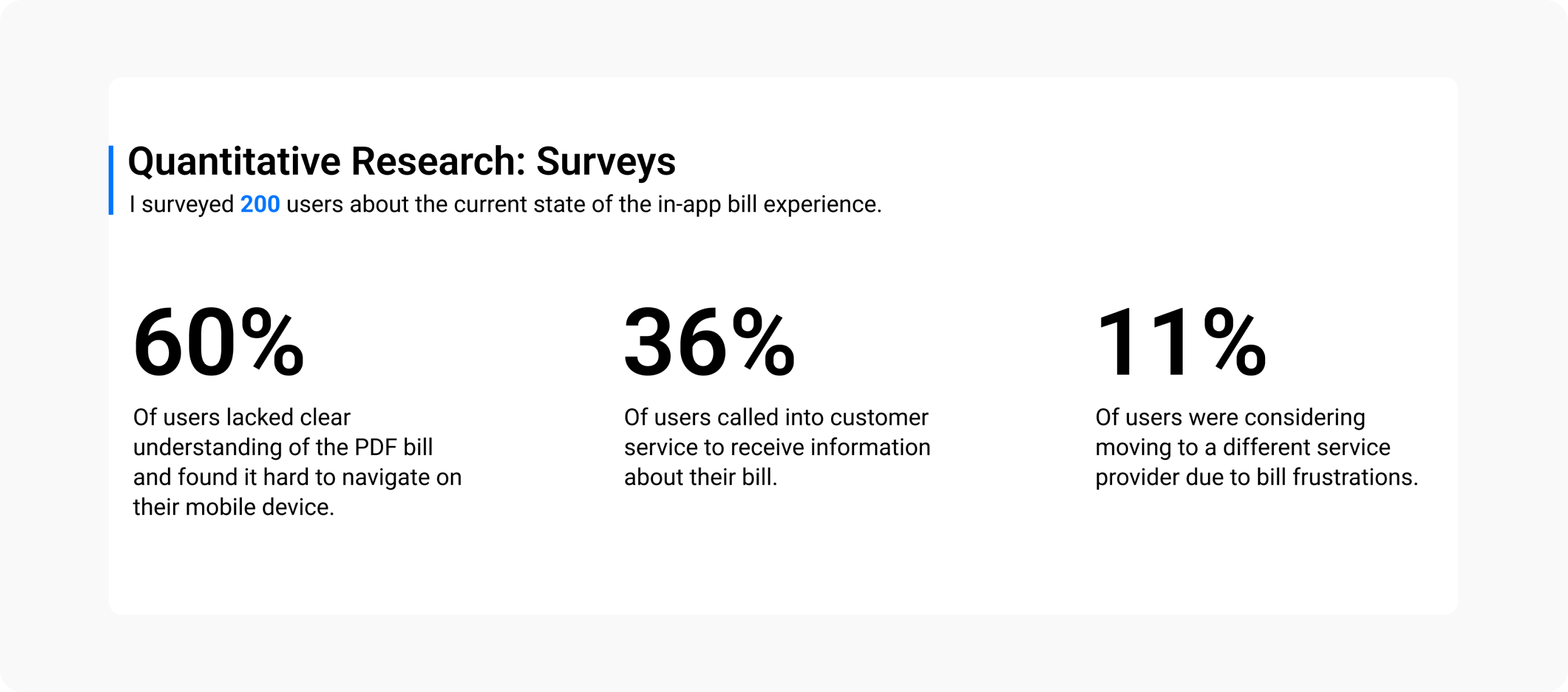
Research and support data revealed:
These insights shaped our approach: creating an interactive, accessible, and transparent unified billing experience that enables self-service understanding.
Rather than redesign the billing engine, I focused on:
Structured language patterns:
Standardizing how charge categories are described
Progressive detail disclosure:
High-level summaries with optional deep dives
Predictable navigation anchors:
For recurring invoice elements across screens.
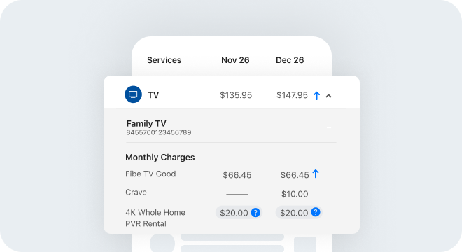
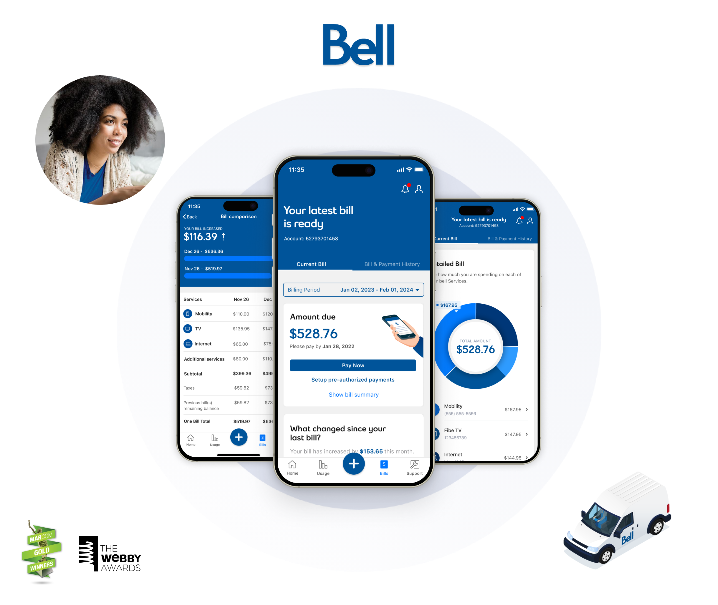
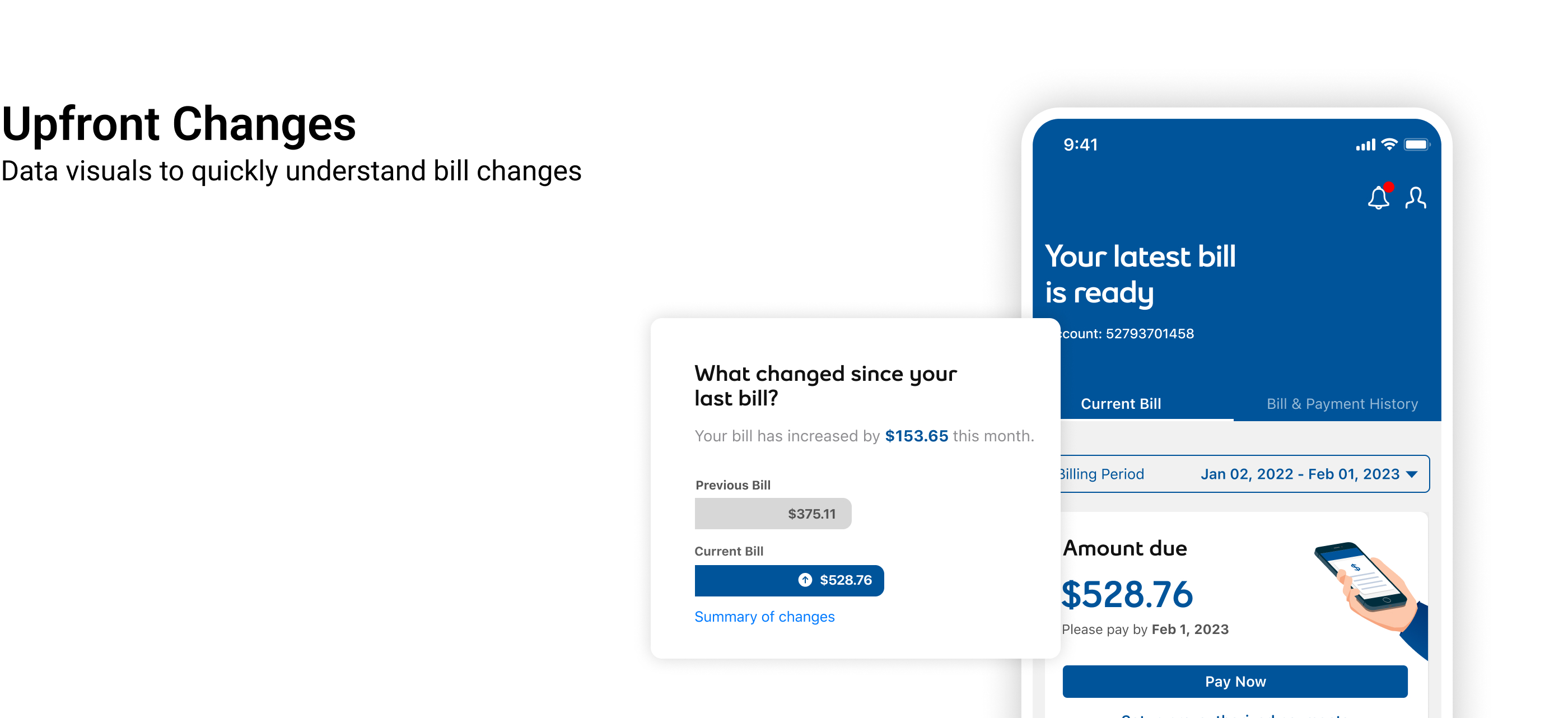
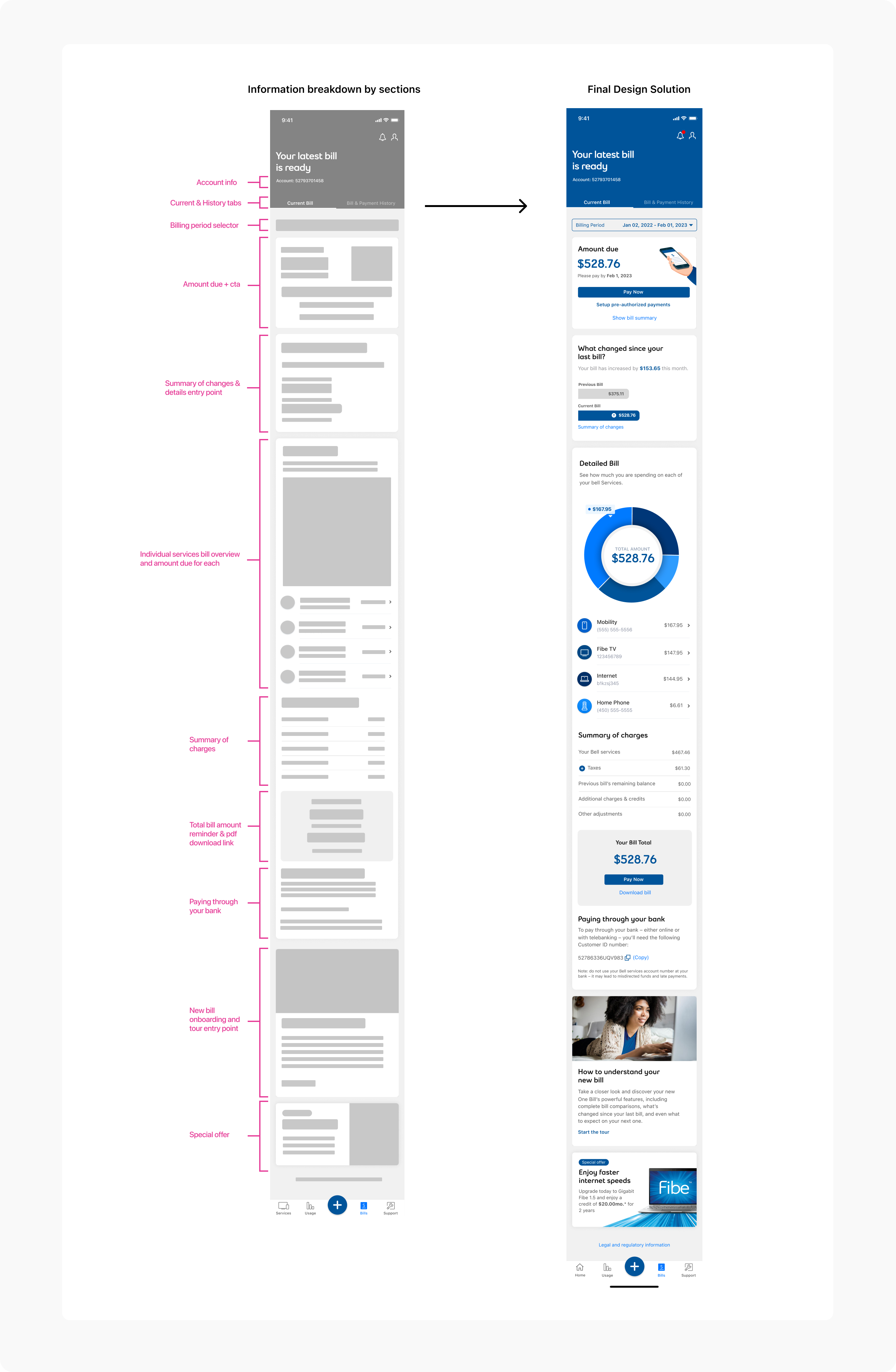
Replace static PDFs with expandable, drill-down charge details. Users can tap any charge to see explanations, dates, and context, making it easy to understand what each line item represents and why it appeared on their bill.
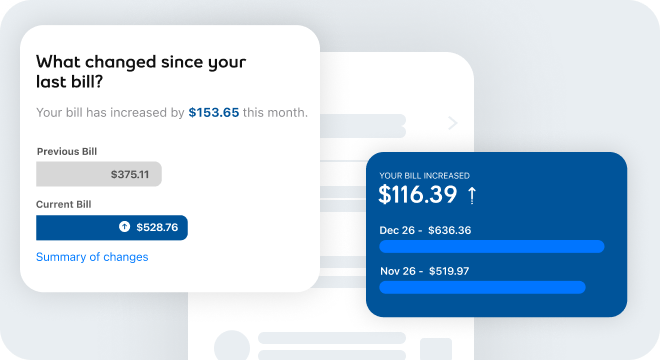
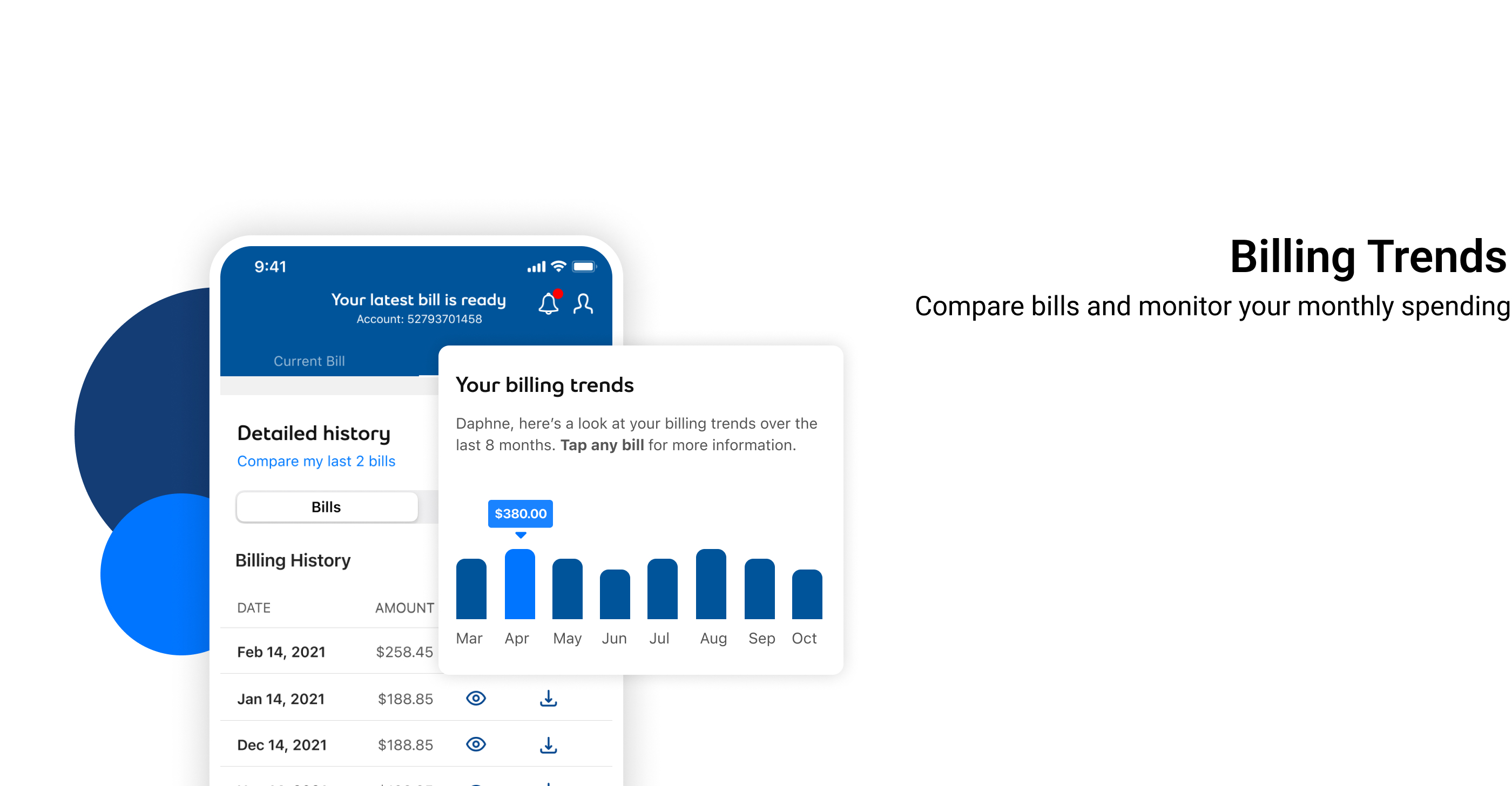
Enable users to compare current and previous bills side-by-side. Highlight changes in charges, services, and usage, helping users understand why their bill amount changed and identify trends over time.
Provide users with a real-time view of their total charges as they make plan, feature, or usage changes during the billing cycle. The dynamic summary updates automatically, showing how modifications impact the next invoice, increasing transparency and reducing billing confusion.
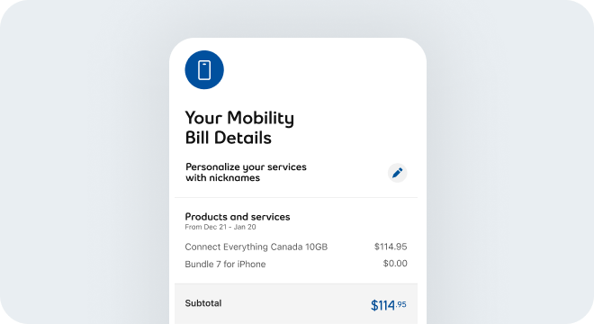
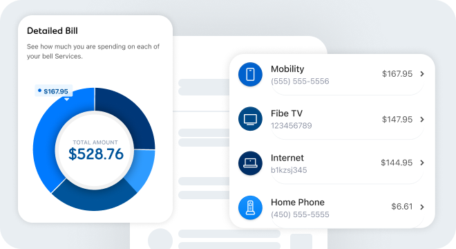
Offer a detailed view of charges per service; mobility, internet, TV, and home phone, including subtotals, discounts, and promotional adjustments. This granular breakdown helps users understand exactly what they’re paying for, compare across services, and identify changes over time.
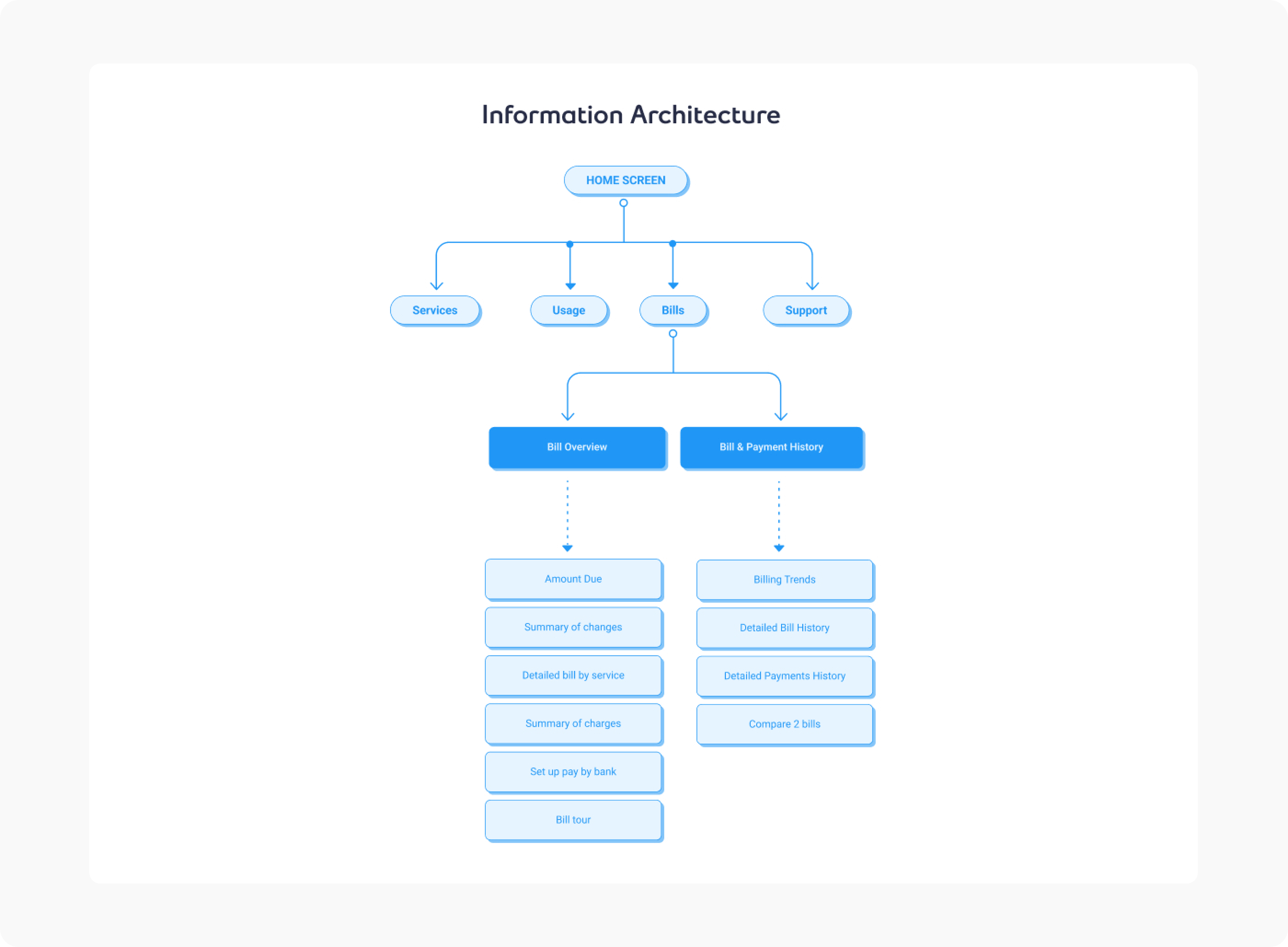
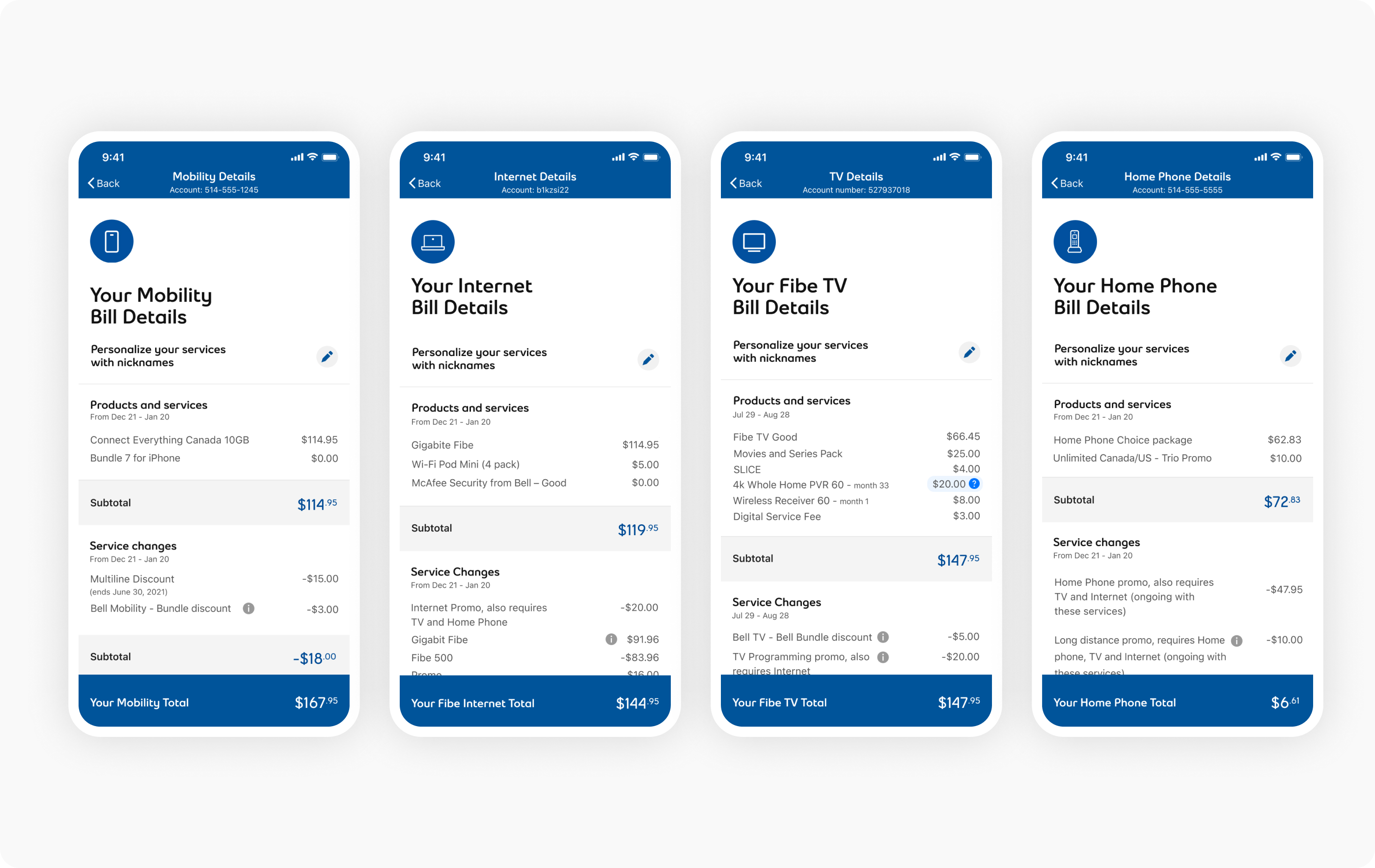 Design of the services details breakdowns for each service offering.
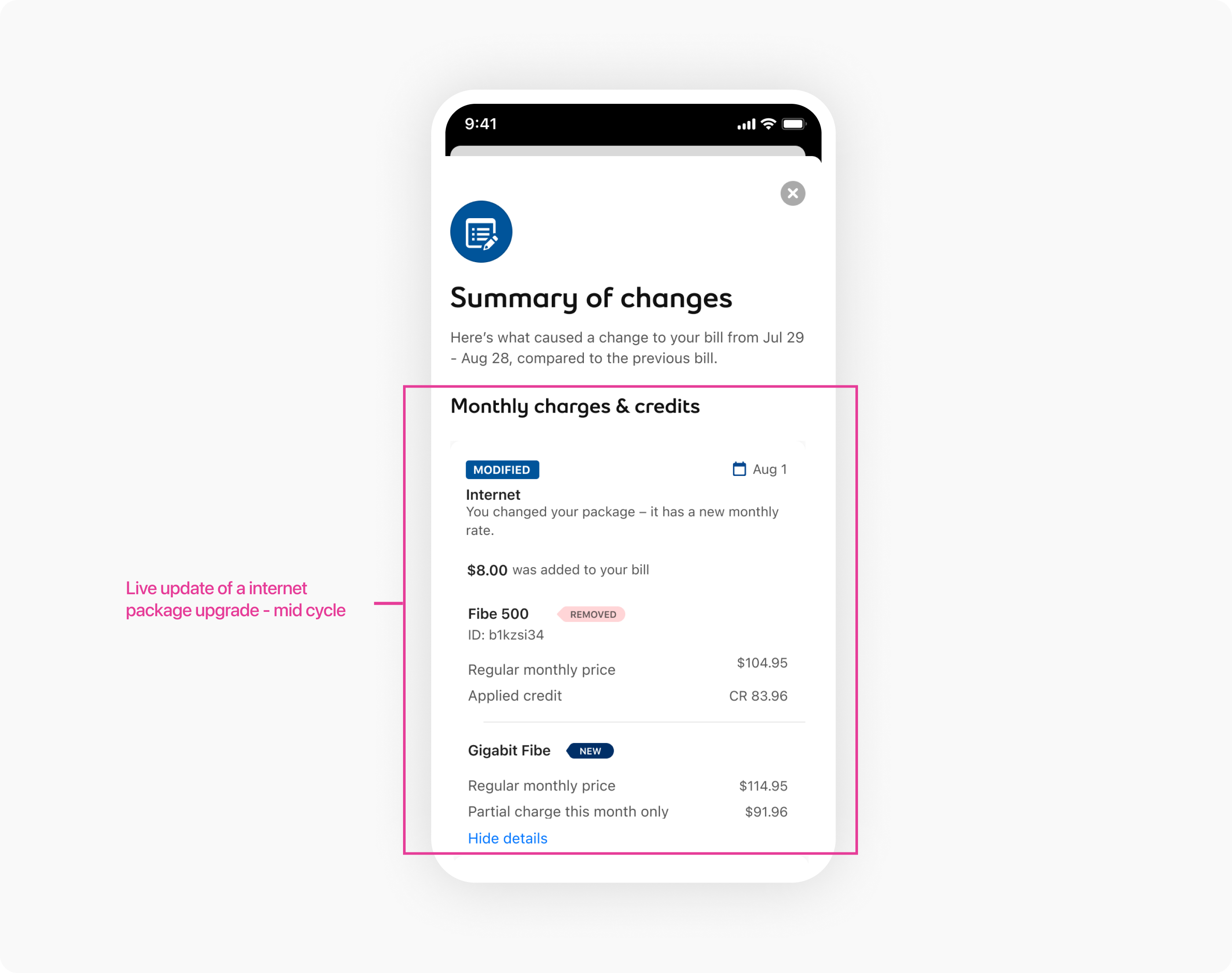 Design of the summary of changes, in real time.
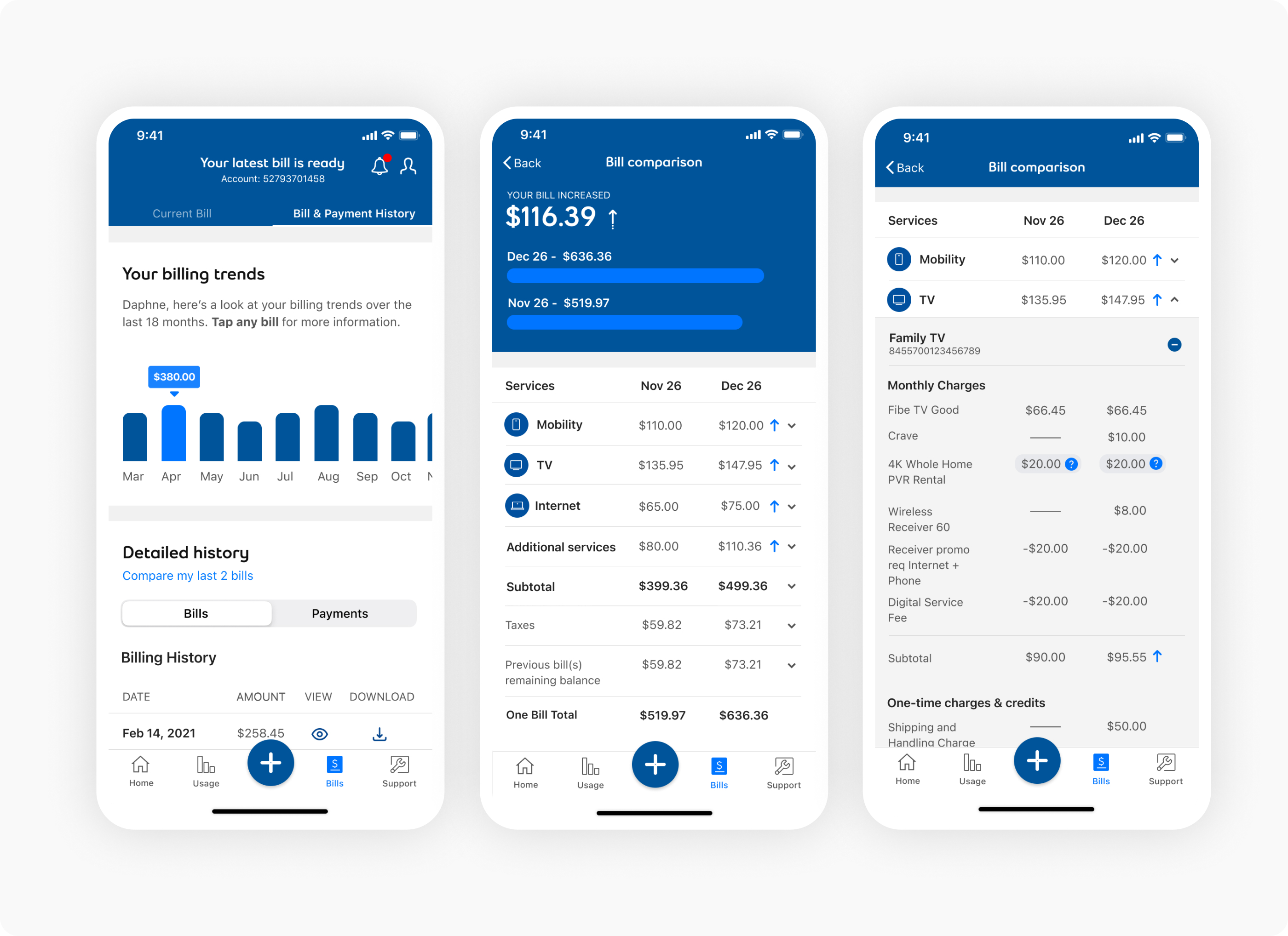 Design of the bill history and comparisons.
To extend the value of unified billing beyond static viewing, we designed a comprehensive bill management system that consolidates multiple services (mobile, internet, TV, home phone) into a single, interactive bill view. The unified architecture allows users to see all charges across services in one place, compare usage patterns, and understand their complete billing relationship with Bell.
The unified bill introduced intelligent charge categorization, usage insights, and predictive billing estimates—helping users anticipate future charges and identify opportunities to save. By combining transparency, interactivity, and accessibility, the unified billing experience transformed billing from a source of confusion into a tool for financial understanding and control.
We did not introduce a fully interactive billing explainer or embedded chatbot in the first release. While these could support contextual help, they required significant backend data normalization, which was outside scope for the quarter.
Trade-off: Immediate contextual assistance vs predictable roadmap delivery
Outcome: Preserved release velocity and prevented dependency risk on backend changes.
Some stakeholder groups requested inline promotional detail expansion on the main invoice view.
I resisted this because it increased cognitive load and diluted the primary charge hierarchy.
Trade-off: Comprehensive detail exposure vs clarity and scanability
Outcome: Cleaner core summary reached wider adoption in testing.
We aligned UX language patterns with Legal and Regulatory frameworks upfront, so copy did not require rework during QA.
This protected delivery timelines and reduced last-minute iterations.
Trade-off: Generic language vs maximally detailed descriptions
Outcome: Compliance confidence with minimal overhead
We standardized charge category labels and progression patterns across screens. This decision reduced ambiguity, created reusable UX patterns, and supported future expansion of dynamic billing insights.
Trade-off: Limited customization vs operational consistency
Impact: Higher predictability in customer interpretation across invoice types
The unified billing initiative shifted billing from a high-volume support driver to a scalable self-serve experience grounded in clarity and structured transparency.
Measured impact (first 6–9 months post-launch):
Most billing calls were driven by confusion, not errors. By making charges scannable, comparable, and drillable, we reduced the need for support intervention. Clarity, not correction, was the lever.
PDF invoices failed on mobile because they weren’t built for touch or progressive disclosure. Replacing static layouts with native mobile patterns increased engagement and improved comprehension. Mobile-first is structural, not cosmetic.
Accessibility was not just compliance. Designing for screen readers, semantic structure, and keyboard navigation enabled independent self-serve for users who previously had no alternative. Accessibility directly reduced support reliance and expanded adoption.